
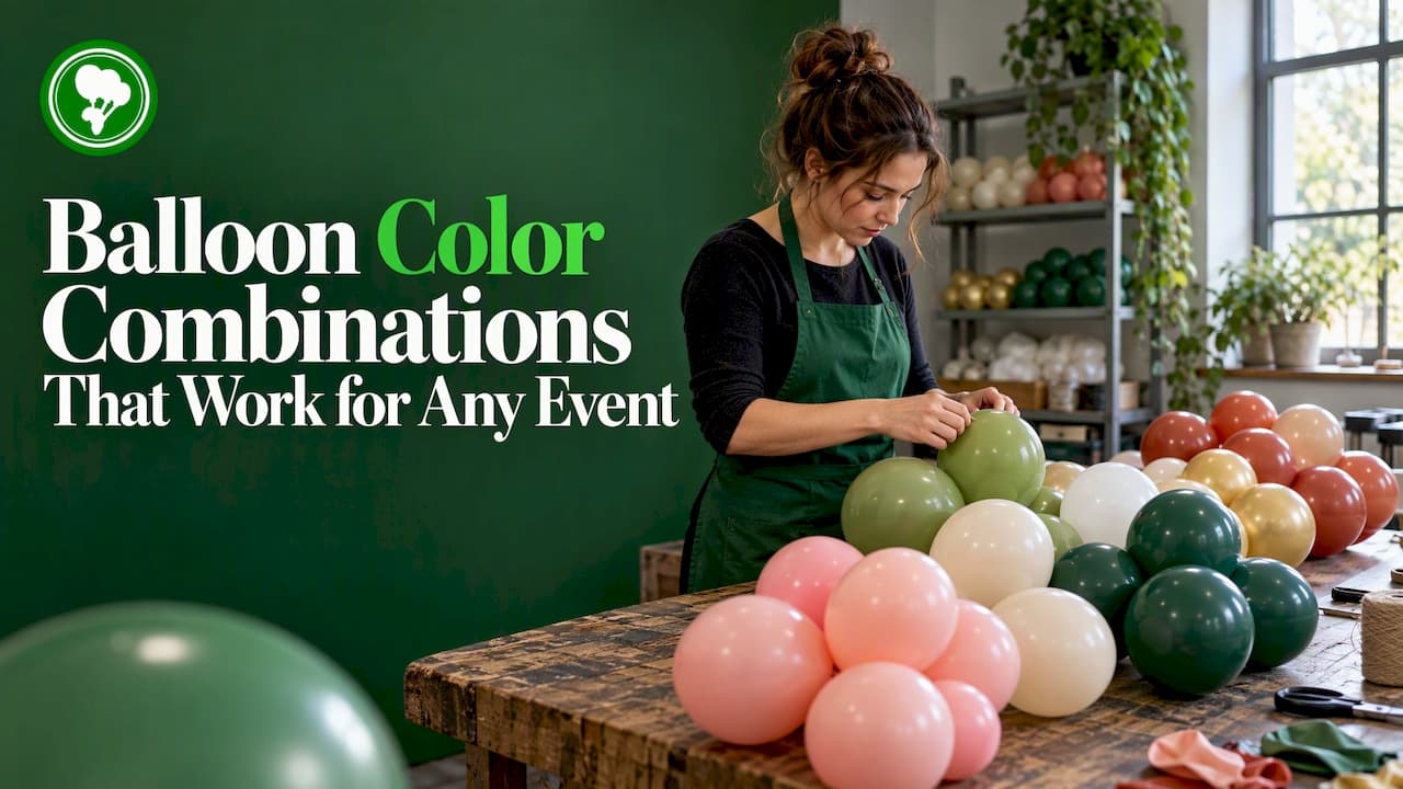
The best balloon color combinations start with one anchor color, add a supporting shade and finish with a small accent. Pick the anchor from your brand, invitation or venue, test the mix in the actual lighting, and keep the total to three or four colors. The rest of this guide shows you how, with ready palettes you can copy and the checks that stop a good idea looking muddy at a distance.
TL;DR
- Build every palette around one anchor color, then use a roughly 60% / 30% / 10% split between main, secondary and accent shades.
- Mixing finishes (matte with chrome, for example) in one hue gives more depth than adding extra colors.
- Check your mix against the venue's lighting and in greyscale: if the colors stay distinct without hue, they will read from across the room.
- For brand work, start from your brand guide's main color and ask your supplier how closely it can be matched before you order.
- Keep to three or four colors for arches, garlands and backdrops. More usually looks cluttered.
Table of Contents
- Start with one anchor color
- The 60-30-10 rule for balloons
- Combinations that reliably work
- Add depth with finishes, not more colors
- Test colors in the room, not on the screen
- Matching balloons to a brand color
- Our perspective: fewer colors, better balloons
- Palettes by occasion
- Shapes change how colors read
- Buy the colors you have planned
- A short planning checklist
- FAQ
- Sources
Start with one anchor color
Most bad balloon palettes fail because nothing was decided first. Event décor specialists advise building the palette around one main color taken from an existing brand guide or invitation design. Everything else then supports it.
This matters most for businesses. A balloon wall at a product launch is part of your marketing, and it should look like a cohesive extension of it rather than a standalone party element. For private celebrations the anchor is simpler: the birthday child's favorite shade, the bridesmaids' dresses, the cake.
A quick way to choose the anchor:
- Name the one color people should remember afterwards.
- Check that it exists in the balloon range you are buying from.
- Decide whether it is a dominant color (big areas) or a statement (small, bold).
Color is also a communication tool in South Africa's event scene. A recent example is a spirits brand that took a tangerine theme to a Pantone-led event series, using one color to align the product with a lifestyle. You do not need that budget to use the same idea: one color, repeated with confidence.
The 60-30-10 rule for balloons
A widely used design guideline suggests that 60% of a design is a dominant color, 30% a secondary color and 10% an accent. Applied to balloons, it translates into numbers you can actually order.
| Balloons in the build | Dominant (60%) | Secondary (30%) | Accent (10%) |
|---|---|---|---|
| 100 balloons | 60 | 30 | 10 |
| 200 balloons | 120 | 60 | 20 |
| 300 balloons | 180 | 90 | 30 |
The split is a starting point, not a law. A garland with a gold accent may need fewer than 10% gold to feel luxurious. A kids' party may want a 50 / 30 / 20 split so the bright accent shows. What the rule protects you from is the 25% / 25% / 25% / 25% mix that looks like a bag of sweets spilled on the floor.
Combinations that reliably work
These pairings turn up again and again in the top-ranking guides because they are balanced. Treat them as tested starting points.
Classic two-color pairs
- Gold and white: weddings, anniversaries, baby showers. Clean and warm.
- Purple and pink: birthdays and girls' parties. Add white to stop it becoming heavy.
- Yellow and blue: sunny, high contrast. Good for kids' parties and summer events.
- Black and gold: milestone birthdays, graduations, corporate evenings.
- Navy and silver: formal launches and year-end functions.
Three-color palettes
| Occasion | Dominant | Secondary | Accent |
|---|---|---|---|
| Baby shower | Soft white | Pastel pink or blue | Gold |
| Wedding | Ivory | Sage green | Rose gold |
| Kids' birthday | Sky blue | Yellow | Orange |
| Corporate launch | Brand color | White | Silver |
| Graduation | School color | White | Gold |
| Summer garden party | Coral | Lemon | White |
A South African planner's corporate brief gives a good example of restraint: a black, white and silver launch for a catering company. Three colors, no apology.
Warm versus cool
Warm colors such as red, orange and yellow feel lively and energetic. Cool colors such as blue and green feel calmer, as one popular balloon color guide notes in its overview of how to choose a palette. Match the mood to the occasion: a children's party wants warm, a retirement dinner or a spa-themed corporate day may want cool.
Add depth with finishes, not more colors
This is the technique that separates a polished build from a busy one. Decorators often mix different finishes of the same hue, such as matte and chrome, to create visual complexity without needing a long list of colors. That approach is often more effective than adding colors, which can look cluttered from a distance.
In practice:
- One hue, two finishes: matte sage with metallic-looking sage reads as richer than sage alone.
- Neutral base, shiny accent: white or cream latex with a small run of gold or silver.
- Pastel body, deeper tone: a pale blush garland with a few dusty-rose balloons threaded through.
It also simplifies buying. Fewer hues means fewer sizes and shades to track, and an easier time if you need a top-up on the day.
Test colors in the room, not on the screen
A swatch on your phone and a balloon under venue lights are two different things. Professional decorators check combinations against the venue's lighting, for example warm tungsten versus neutral LED, because lighting can shift pastel and metallic finishes, flattening depth or changing the perceived hue.
Three checks before you order
- Ask about the lighting. Warm bulbs tend to push whites toward cream and can make pale blue look greyer. If you can, visit at the same time of day as the event.
- Run a greyscale test. Take a photo of your sample balloons and turn it to black and white. If the colors stay distinct in greyscale, they should keep their impact at a distance. If two shades merge into one grey, they will merge on the day too.
- Look at the backdrop. A navy balloon vanishes against a dark curtain. A white balloon vanishes against a white wall. Contrast with the background matters as much as contrast between balloons.
If you are buying online, order a small sample bag first for anything with a hard deadline. Photos are a guide; the balloon in your hand is the answer.
Matching balloons to a brand color
This is where businesses lose most time. Your logo is a specific color, and a balloon is dipped latex, not printed paper, so an exact match is not always possible.
What helps:
- Know your reference. Have your brand guide's Pantone, CMYK or HEX values ready. Say which one is the master.
- Choose the nearest shade from a wide range. A bigger range of stock colors gives you a closer starting point. We offer over 50 colors in our latex range.
- Use printing for the exact part. Where the brand color must be spot on, such as a logo, print it on the balloon instead of relying on the balloon's body color to match. Our branded promotional balloons carry your print on a stock color that complements it.
- Design for contrast. Print on a color that makes your logo legible. A pale logo on a pale balloon disappears, however accurate the match.
- Ask before you commit. Tell your supplier what the balloons are for, and ask how close they can get to your reference color and what proof they can show.
For campaign thinking beyond color, our guide to brand activation balloons covers how to plan a balloon campaign that works.
Our perspective: fewer colors, better balloons
We make and print latex balloons, and the same mistake lands on our desk every season: too many colors, too little plan. A customer wants eight shades because all eight look nice in the catalogue. On the day, the arch looks like confetti and the brand color is lost.
Our advice is to choose the anchor first, then a supporting color, then one accent, and then stop. If you want richness, ask about double-stuffed balloons, where one balloon sits inside another, which lets you match event palettes with a more layered look without widening the palette.

We also think the material should be as thoughtful as the palette. Our latex balloons are made from sustainable rubber tree sap, are 100% natural and biodegradable, and carry EN71 certification. That means you can build a bold color scheme for a wedding or a corporate function without choosing between looks and values.
One last practical point: order a little extra of your anchor color. Running short on the main shade is a far bigger problem than running short of the accent.
— Richard

Palettes by occasion
Weddings
Keep it soft and tonal. Ivory, sage and a hint of metallic work for garden venues; white, blush and gold for classic ballrooms. Mixed finishes in one shade add romance without competing with the flowers. If your wedding is also a transport-heavy day, carry the palette through to the ride too: these party bus birthday ideas show how a colour theme can follow guests from the venue to the vehicle.
Kids' parties and restaurants
Bright, saturated, high contrast. Primary-color mixes are friendly, and a character or theme usually dictates two of the three colors. For a restaurant kids' menu, one signature color on every balloon makes the table instantly recognisable. Our piece on restaurant balloon marketing has more ideas that fill tables.
Corporate events and launches
Brand color, white and one metallic. Keep the palette consistent with your stage, signage and invitations. If the room is dark, choose lighter or metallic balloons so they carry; if it is bright and white, go for deep tones.
Baby showers and gender reveals
Pastels in a tight range. Use white as the dominant shade so the soft colors feel intentional rather than washed out.
Graduations and school functions
School colors as dominant and secondary, with gold or silver as the accent. Check both colors exist in the range before promising a match.
Shapes change how colors read
The same palette behaves differently in different builds.
- Arches and garlands: colors blend into each other, so a gradual shift from dark to light works well. Use the accent sparingly in clusters.
- Bouquets and table pieces: colors are seen up close, so finishes and sizes matter more. See these balloon bouquet ideas for tables and backdrops.
- Centerpieces without helium: a solid single color often looks sharper than a mix at small scale. Our balloon centerpiece styles all hold up without a tank.
- Ceiling and floating displays: go lighter and brighter, because shadows will darken everything.
If you are planning a helium-free setup, our guides to helium-free balloon decor and balloon sticks versus string cover the mechanics.
Buy the colors you have planned
Once your palette is set, the order is simple. For stock colors across our latex range, browse the colourful latex balloons and foil balloons. For printed balloons, stress balls, shakers, inflatables and event décor, see the full product range. Our decor teams support corporate functions, weddings and promotional events, and we deliver nationwide.
If you are not sure how to combine your brand color with a balloon shade, tell us the occasion and the reference color when you enquire. That one detail makes the recommendation far more accurate.
A short planning checklist
- Choose the anchor color from your brand guide, invitation or venue.
- Add a secondary color and one accent. Stop at three or four colors.
- Split quantities roughly 60 / 30 / 10.
- Decide the finishes. Mix finishes within a hue before adding another hue.
- Check the venue lighting and the backdrop color.
- Test a sample in greyscale.
- Order a little extra of the anchor color.
- Prepare latex properly: inflate with gel the day before where the guide suits your build, and pick a sealing method before the day.
FAQ
What balloon colors go together?
Pairs with a clear light-dark or warm-cool contrast work best: gold and white, navy and silver, yellow and blue, purple and pink. Add a third color only as a small accent. If you are unsure, pick one color and use two finishes of it.
How many colors should I use in a balloon arch?
Three or four is the practical limit. More colors tend to look cluttered from a distance, and the arch loses its focal point. Use the 60 / 30 / 10 split to decide how many balloons of each shade you need.
Can balloons match my brand's Pantone color?
Not always exactly, because balloons are made in a fixed range of latex shades. Choose the nearest stock color and print your logo or brand mark where precision matters. Send your reference values to your supplier and ask what they can match before you order.
What are 260 balloons?
They are the long, thin balloons that balloon artists twist into animals and sculptures. The name refers to the size: 2 inches wide and 60 inches long when fully inflated. They are a good way to add a thin line of accent color to a build.
Sources
- Best Balloon Colour Combinations and Custom Palettes
- Balloon Arch Color Palette Guide: 51 Palettes with Hex Codes
- Gordon's BOS Brings Tangerine Style to Pantone Sundays
- Luxury Corporate Event Planner South Africa: product launch case